It’s difficult to sit on the fence when it comes to pastels; you either love or hate them. I’m a fan. But there’s a difference between sweet and saccharine. This works because the floors and walls are neutral and the table and chairs rustic and washy looking. I adore the stacked crockery in the cabinet. And the potted flowers are gorgeous. But I wonder if a coloured shade would have been better?
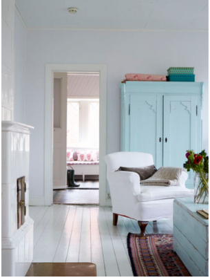
I love this image. I love the open door and hint of pink coming through. I think it works so well because the pastels are restricted to two shades – pink and blue – and it’s simple rather than fussy. The result is more sophisticated than sweet.
This pic just makes me feel happy. It’s such a clever but simple mix of textures, colours and stripes. And, from a styling point of view, the cool cacti match the subtle Mexican feel of the hats and rugs perfectly.


0 comments:
Post a Comment